
Sunday 30 October 2011
Outtakes Video
I was playing around with some of our left over footage and decided to make this outtakes video. It's a bit of fun really, but we can also see some of the bits where we went wrong and we can also use this a sort of a self-evaluation of the difficulties of filming our music video. This also gives an insight into how we filmed the video.
Friday 28 October 2011
Music Video Version 1
Here is the first version of our music video. We took approximately 2.5/3 hours to film and around 3 hours to edit. We have kept to our storyboard reasonably well. We do have around 30+ minutes of footage to play around with for alterations for our final piece.
Filming
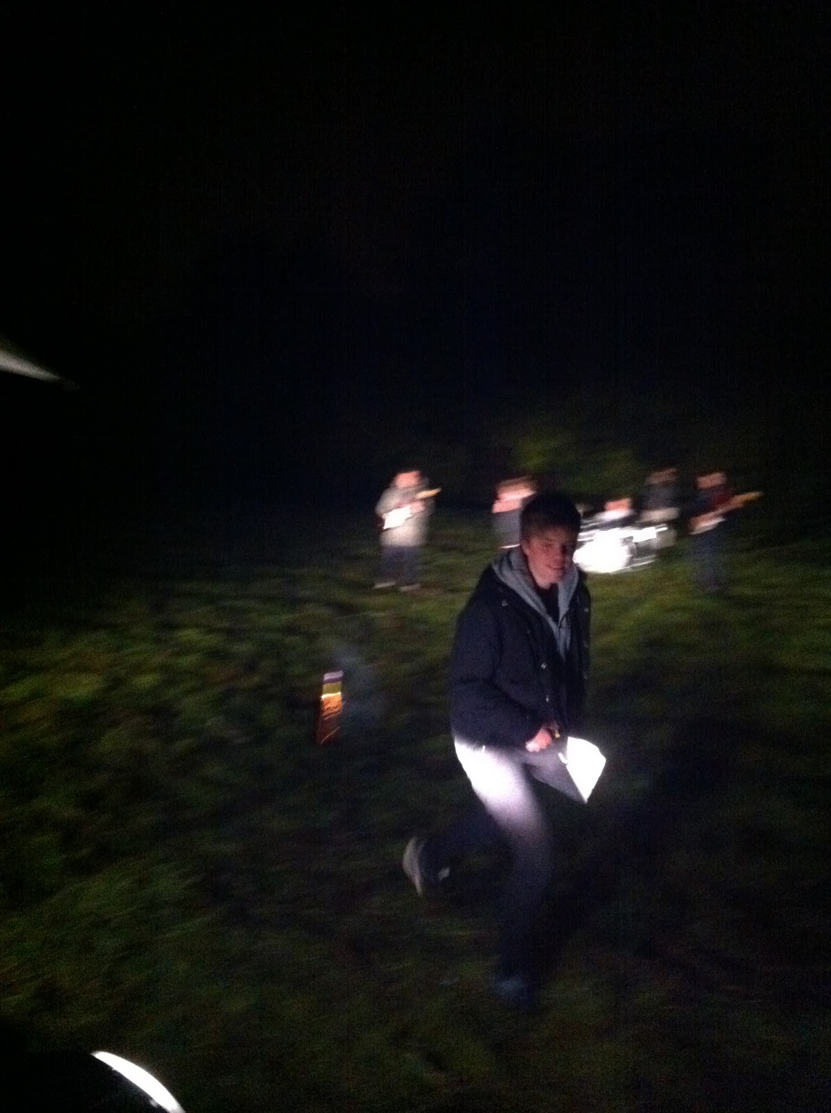
This evening we filmed in the field, for a draft music video. (Yes I am blogging at 02:42). We found that overall filming went well, the weather held out, fortunately and the lighting from cars worked perfectly. If we could pick out one thing that maybe went wrong it was that we maybe missed 2 shots but this is only a very minor issue. Below are a few pictures taken on my iPhone of the shoot.


Thursday 27 October 2011
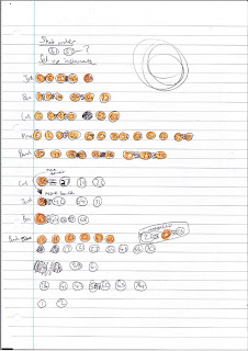
Shot Schedule
As Pat and I have both discovered after discussing with other students who have managed to film their videos, a lot of the time shots can get easily muddled up. Another problem is with continuity, rather than moving the camera back and forth between different shots we want to film all similar shots, with the same band member at the same time. So ideally, we will never move the camera from one angle back to the same angle, thus giving us a good oppurtunity to keep shot similarity and continuity.
A difficulty in our vision for our video also is that we have 2 different types of shots in terms of what they feature. Some shots feature the band performing the song with instruments then the others will feature them dancing. This will be a factor in deciding what order we shoot, so that we are not moving instruments, particularly a drum kit, back and forth from in and out of shot.
For this puropse, I have created a shot schedule. At first glance, this will not make much sense to anyone besides me or pat. Basically, all shots are on this page going in order. The highlighted orange numbers are shots which feature the band playing instruments, the non-highlighted are those with the band dancing.
This will be the sheet in which we will work from when filming.

Note: Shots 30 & 31 feature a band member setting off a firework, this may not feature in our draft so I have not included them fully in the shooting schedule.
Tuesday 25 October 2011
Filming the music video - update
For the draft video, we will be filming using a canon 500d, which was kindly lent to us. One change we have made for the filming is that of the members of the band. As 2 of the band members are busy, we are going to replace them with Ed Price and Sam Burnham or Sam Hallam. For the final media shoot, we may use the original band members, depending on who we think suits the roll best.
Another problem we face ahead of filming is that of the weather. In an ideal world we would have filmed last week, when the weather as a bit brighter but I happened to be on work experience, without anytime in evenings to film. If rain does occur we will have to film at a later date, as everything is planned to be outside.
Another problem we face ahead of filming is that of the weather. In an ideal world we would have filmed last week, when the weather as a bit brighter but I happened to be on work experience, without anytime in evenings to film. If rain does occur we will have to film at a later date, as everything is planned to be outside.
Monday 24 October 2011
Prop List
Props that we will need for shooting our video:
Instruments:
Instruments:
- 2 x guitars
- 1 x bass guitar
- 1 x drum kit
- 2 x mic stand
- 1 x drum sticks
- 1 x maracas
Other:
- 3x fireworks
Sunday 16 October 2011
Album name and tracks - update
For my digipak draft, I have chose to use Little Comets debut album title, "In Search Of Elusive Little Comets. I felt that as it has already being made, the title just works well with my digipak. I also used the same track-listings as on "In Search Of Elusive Comets", as there is a diverse range of track names.
Friday 14 October 2011
Draft magazine advert
Below is the draft magazine advert, I tried to keep it simple taking inspiration from Radiohead's "In Rainbows"...


One thing I am going to take into consideration for the next time I draft is maybe using an image, and changing the font.
Digipak draft
For my draft version of the digipak, I tried to keep things very simple, taking inspiration from artists like Jamie xx and SBTRKT...


Draft Album Magazine Adverts/Posters
I have used the same images, fonts and colour schemes to create these draft posters. I feel as though this would help promote the alum better as the audience could become familiar with these motifs and recognise them as promotion of the album increases.


CD Cover analysis 3
The Chemical Brothers - Surrender

This album cover features a long wide shot with focus of a man throwing his arms up in the sky. The image has been filtered and saturated. It has an effect to make only block colours show up and almost cartoon-like, I feel this works very well and looks good on an album cover. The image is shot at the Olympia arena in London, it features the crowd in the background and a mainly focused person in the foreground, which is the icon of the cover. While the original picture may have been a bit blander, with a basic, darker colour-scheme - the use of filtering and enhancing the photo has made it very bright and colourful. The band name and album title are in the top corners of the cover in contrasting white. The font used for 'The Chemical Brothers' is the signature font for the band, while 'Surrender' is in a basic text, but works well on this cover.

On this inside cover the only thing featured are the credits to the album written in blue text on a plain white background. The font is basic and does not need to be decorative or artistic in anyway as it is not aimed to be eye-catching.

The CD is very basic, again featuring the signature font for the band name and some legal information including the record label etc.

The back cover opposes the bright and colourful front cover with a mainly black back cover. There are close up facial shots of the members of the band, with low lighting to match the colour of the background. The track listing is written very basically in a smart font, which appears very formal. The Chemical Brothers logo is shown at the top of the page and the spine of the album.
Thursday 13 October 2011
Draft CD covers

I used this image I took quickly to create these draft covers, Although I have not chosen one final draft design. I have gone for a black and white filtered image of the models. I like the use of coloured text more than just plain black texts as it gives me a better colour scheme that I could use throughout my digipack.


Magazine Advert analysis 3
MGMT - Congratulations


This advert features the original album cover with some text underneath in a simple layout.
The image is a colourful cartoon from the album cover. The black box with white text contrasts this quiet well and gives the information about the album.
The layout almost showcases the album and the text is a caption to it. The text is in an effective font which is simple yet eye catching. There is not much to say about the actual advert itself a lot of the focus is on the album cover. Personally I think the artwork should be stretched or cropped to fit the whole page, that way it is more eye catching, this particular advert is too much of a contrast from the cover to the text at the bottom.
Magazine Advert analysis 2
Enter Shikari - Tribalism
 This magazine advert is for a compilation album by Enter Shikari. It has a simple layout with the title text over a grey background which features some text.
The signature Enter Shikari band motif is used, this will make it recognisable to people who are familiar with the band. Another motif used is the lion, which is made using different coloured text in the background, this works well as it is quiet subtle but almost a bit hard to notice.
The colour scheme is fairly dark except from the band moto 'We won't stay silent' which is in a light blue so that it stands out. The band name has some slight scratches on it for effect and to give the idea of the band being a bit 'rough' which is typical of their character and genre.
The layout is pretty simple, all text is centred and in a similar serif font.
Overall I think this magazine advert works well, it's quiet simple with only text featured. Although this would be different to an album cover as I think that should feature an image, in my opinion.
Magazine Advert Analysis 3

The 3rd magazine advert I have chose to analyse is The Chemical Brothers "Further". The image used in the magazine advert in very unique, with an eye-catching image of a woman breaking the surface of the water in a blue dress, almost looking like a mermaid. She is seen to be diving down into the see, thus fitting in with the album title "Further. Also, the colour is spread down the page and gets darker and darker, as if the woman is going further into darkness.
The layout is all based on the image, with the top two thirds consisting of the main image, with the bottom third having information about the album. The shot used is low angle under the sea to capture the moment the person breaks the surface and this is done to perfection.
The colour scheme is black, white and blue, all coming from the image. The typography, like most magazine adverts I'm simplistic but their is the trademark Chemical Brothers font used for their band name. Overall, I feel that this is the most eye-catching poster, due to the image used.
Magazine Advert analysis 1
Coldplay - Mylo Xyloto

This magazine advert for Coldplay's album 'Mylo Xyloto' features the album artwork but sightly extended from a square to an A4. It features the signature custom font used in the promotion of this album, also the release date is in this so it stands out as much as the album name.
The image used is a mixture of colourful graffiti and bright blotches of colour. The white text works well with it as it keeps up quiet a bright colour scheme.
Overall this is a very loud and eye-catching advert and would not be easy to replicate as the image or mixture of images seems to be very complicated and artistic and may cost a lot to produce something similar.
Wednesday 12 October 2011
Magazine Advert analysis 2

For LCD Soundsystem's album "This Is Happening" it is all kept fairly simple. There is a basic image of James Murphy, the creator of LCD Soundsytem, in motion, as if he was dancing on stage. He is dressed in a trademark suit and the photo has been rotated. The shot will have been taken as a mid shot of Murphy , from a fairly long distance as his arms are spread.
The layout is simplistic, with a large image in the top two thirds with the information about the album in the bottom third. The colour scheme is quite understated, with a black and white photo/background with a blue font.
The typography is in italics and all in capitals. The font is basic and there is large spaces between letters. Overall The design is made to look a bit blurred and this fits in with their sort of electronic music. I do quite like the idea of using just one image on my band poster/digipak, as it looks quite effective.
Inspirational covers
These are some of the covers I really like the design of, some of these will be the inspiration of the style I want to do my cover in as I like this style and I believe that they are all effective. I like the use of black and white and simple text. I also definitely think that in my own work I will use real images instead of using shapes, text, graphic etc. to create a cover, I think this will allow me to create a more effective digipak with my own skills.


CD Cover analysis 2
Vampire Weekend - Vampire Weekend


This album cover is very simple, but I feel it's also very effective. It features a polaroid image, which has been filtered slightly and the bands name is contrasting bold white letters. The image has been taken at a house party of some sort. The image was taken by Annie Fields. Here are the original pictures, the left one featuring a couple of the band members.


The image of the chandelier for the front cover has been taken from a low angle. It could seem to be taken with little artistic intent, but either way it has worked affectively for the band's album cover. The bands name, also being the album title, is centred in a basic font across the cover.
The colour scheme is again effective, the image has been filtered with a orange/pink overlay and gives the image a darker look from the original and the white text contrasts it well. The scheme through the cover, back, CD etc. is fairly unattached. The CD is a bright yellow and features the band name in the same font as the cover in blue text. The CD also features abbreviations of the track listings, which is relatively unconventional.

The inside cover features plain black text with two columns with acknowledgements to people involved with the band and a list of band members.

The back cover is again non-matching to any colour scheme and is the only dark part of the digipack. The text used is very different to the block-basic text used on the cover and CD but is quite formal, in a serif font.

I think this album, the cover in particular is quite basic, but eye-catching. I think to design an album cover like this would be fairly simple but the image would have to be right and also eye-catching and work well with the text. However if I could take an image good enough it would be fairly straightforward to replicate this type of cover, as shown with this mock up that I did in about 5 minutes. But this also illustrates the difficulties of making an album cover look professional.

Subscribe to:
Posts (Atom)