
Thursday 22 December 2011
Evaluation Question 1
Video presentation of our answer to Evaluation Question 1: In what ways does your media product use, develop or challenge forms and conventions of real media products?
Wednesday 21 December 2011
Evaluation Question 1 - Digipack and Poster - Harry
Prezi Presentation of the section with my digipack in the answer for question 1.
Tuesday 20 December 2011


Thursday 15 December 2011
Evaluation Question 1 Final Script
For our music video, we decided in the end to create a straightforward illustration video as we felt that this would be the best way for us to make our video look professional and realistic, using the typical conventions of a music video. When we were researching for our music, we spent a night browsing through numerous music videos, both old and new, taking bits of inspiration from certain scenes from many videos, some that use the general conventions of music videos, some that develop these on these conventional music videos and some that completely challenge these videos.
One thing we looked at in detail was the Brit-pop era, with bands such as Blur, Oasis and The Stone Roses influencing our decisions on the styling of our band in the video. In the band, we decided to give the lead singer freedom in what he wanted to wear, as his own personal style is heavily influenced by people such as Damon Albarn, of Blur, Liam Fray, of The Courteneers and Faris Badwin, lead singer of The Horrors. We wanted to create the star image, with him leading the band, being the very "cool" and most unique out of the 4. This style also reflected on the band. We decided to change the band halfway through due to the time they could offer us and the fact that we wanted to have people that could play guitar, as we tried to learn from the mistakes of others.
When I looked at inspiration from other music videos for our music video, The Drums - “Let’s Go Surfing” came to mind. We were always keen on filming the video outside, as we felt it would fit in with the alternative genre we were looking at and was a bit different than the typical performance video. We then decided to develop this idea of filming outside to in a field, which then inspired us to shoot the video in night-time. This then prompted us to look at other videos both night & day, with rural mise en scene. Videos such as Coldplay’s “The Scientist”, Foals “Spanish Sahara” both have outdoor countryside settings but we felt that the camera-shots in these video were edited too slow for a song like us, due to it being fast paced. This fitting in with what Abt stated in 1987, with music videos being directed to create a following by the artists having a unique style, something which we have tried to incorporate into the video.
This then led us to look at videos by bands such as The Vaccines and The Maccabees, especially songs off “Colour It In”, as this is more of a faster paced album. We took inspiration from The Horror’s infamous video “Sheena Is A Parasite” as although the mise en scene and storyline is not at all similar to our music video, the fast paced shots, rough editing and dark lighting work due to the short and snappy length of the song. This is something we developed to fit our product, trying to make a fitting video.
We also tried to emulate some dancing shots on a handheld camera, like those seen in The Drums “Lets Go Surfing”, where the band are dancing, with charismatic frontman Jonathon Pierce hogging the limelight, this being replicated by our frontman in our video. This is a convention we looked to challenge, as this time we had all members of the band dancing, rather than just the frontman.
Friday 9 December 2011
Evaluation Question 4 DRAFT
How did you use media technologies in the construction and research, planning and evaluation stages?
When planning the video we looked into the hardware that would be available for shooting a video. Before we had an idea for a video we were set to use a panasonic handheld video camera, normally used for home videos. This seemed good enough for us at the time to produce a professional quality video but when we decided to film in the dark we immediately switched our attention to looking for a better camera. The problem with filming in dark conditions is that the video would be grainy and there would be visual noise on the clips. We managed to borrow a Canon 500D SLR Video, a brilliant quality camera that suited our needs perfectly.


Youtube and vimeo were the main websites used for research as most music videos around are on these sites. Many images of digipacks and posters are available on the internet and this was where most research was taken place. When analysing videos, tubechop helped me pick out key components from each video.

When creating the digipack and poster, a key tool that would
Evaluation question 2 draft
My part to question 2...
I feel that with my digipak, the simplistic and quite different style of the band combines and links the two together. Rather than doing a simple band shot, I think that the image of the band would be to be quite cool and stand out. A similar band like The Arctic Monkey’s also used a very simple digipak for their latest L.P., “Suck It And See”. I do feel that I maybe should have looked at incorporating a band photo or just a picture of the frontman, as with my digipak you would not know about the bands “cool” image and may feel the record would be of a different genre.
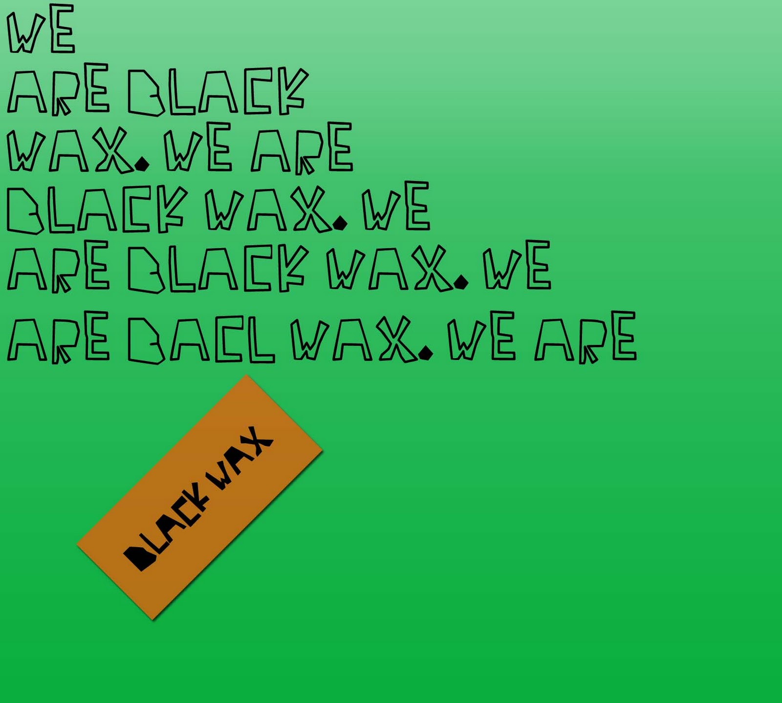
The same can be said about my poster, which however does advertise the band name and due to the repetition of “We Are Black Wax”, it creates mystery and would be likely to gain interest. This also fits in with the bands quite mysterious style.
Evaluation question 3
For our music video, we received many pieces of audience feedback at many stages of the campaign.
When we first pitched the idea to teachers and peers the idea was quite different. Initially we intended to create a video in numerous locations with a large amount of people. The main feedback we received was positive and although the overriding theme was that having the two locations of a field and city was a good idea, one of our peers highlighted the fact that it may be hard to link in the contrast and we decided to take this into account, as we wanted our music video to look professional. Also, in our original idea, we intended on having more of a fun feel to the music video, with many people being in it dancing. This idea was also successful in our pitch but during the making process of the video, we decided that it was probably unrealistic and changed the way we anted the audience to perceive our band.
When we displayed our draft music video, again the feedback we received was very good. I would, at the time, preferred more negative feedback, so that we could make more changes and have a greater idea of what to do. We received some things that we needed to change from Mr Ford & Mrs Hammond. Initially, we had included a firework that went off, as in the song there is the sound of a firework exploding. Although we had some good shots, the actual explosion was disappointing and we were told to omit this from the video which we agreed with.
Also, feedback we received told us to scrap some of the long-shots as the focus was not brilliant and the air looked foggy. We also tried to make the video look more serious, with less dancing and more different angled shots, as this would fit in more with the bands image.
For my digipak, the feedback I received was again quite positive. A lot of people felt it was quite different copared with the typical digipak and fit in well with the band quirky image. After my draft, I did change minuscule details such as adding a full stop on one of the pages and changing the font on the back panel, to the one used on the front. This was also similar with my CD poster draft, I just changed the font and added the bands facebook/twitter.
Evaluation Question 1 DRAFT
In what ways does your media product use, develop or challenge forms and conventions of real media products?
When researching into digi-packs I again looked for examples that I liked. I think a key aspect about a front cover that I thought should be on is the band. Razorlight - Razorlight was an album cover that I thought was simple but effective. Another similar inspiration is The Hives 'Veni Vendi Vicious'. I featured the band standing in a similar pose but instead of having just a black and white cover I decided to add some colour with the red and blue in the title. Instead of just having a black and white picture of the band I used an effect on photoshop (posterize) to make the photo just black and white, an effect that I believed worked well. This effect is similar to that used on Kasabian's Velociraptor! front cover. I thought this red and blue worked well, so I carried it on throughout.


 For my band logo I decided that the band's name in a simple font would work well, I made it italic as I quite liked the look of that on The Stroke's albums. I've used the band name as a motif throughout my digipack.


Inside the cover I was originally going to keep it very simple, featuring the credits on one page, a CD outline in the middle and some location pictures on the right hand side page. I did this on my draft, but when I saw it finished I realised this didn't work well at all.
The feedback I received gave me the idea to feature more images of the band, I used images from stills of the music video, in the same effect of black and white posterize. I also changed the inside to have a low opacity patterned red and blue background, so that the 3 panels were joined together as I felt this would look better and was a common feature in most digipacks I researched into.
The pattern used on the middle and left back panels was sort of an impulsive decision when making these on photoshop. I wanted to keep the colour scheme of red and blue and was planning to just use one of these colours as a block background. I played around with some shapes and then patterned the blocks together and in the end looked quite effective. I used the font 'futura' throughout as I felt it was effective in many different forms throughout digipack and poster.
When researching into digi-packs I again looked for examples that I liked. I think a key aspect about a front cover that I thought should be on is the band. Razorlight - Razorlight was an album cover that I thought was simple but effective. Another similar inspiration is The Hives 'Veni Vendi Vicious'. I featured the band standing in a similar pose but instead of having just a black and white cover I decided to add some colour with the red and blue in the title. Instead of just having a black and white picture of the band I used an effect on photoshop (posterize) to make the photo just black and white, an effect that I believed worked well. This effect is similar to that used on Kasabian's Velociraptor! front cover. I thought this red and blue worked well, so I carried it on throughout.

Inside the cover I was originally going to keep it very simple, featuring the credits on one page, a CD outline in the middle and some location pictures on the right hand side page. I did this on my draft, but when I saw it finished I realised this didn't work well at all.
The feedback I received gave me the idea to feature more images of the band, I used images from stills of the music video, in the same effect of black and white posterize. I also changed the inside to have a low opacity patterned red and blue background, so that the 3 panels were joined together as I felt this would look better and was a common feature in most digipacks I researched into.
The pattern used on the middle and left back panels was sort of an impulsive decision when making these on photoshop. I wanted to keep the colour scheme of red and blue and was planning to just use one of these colours as a block background. I played around with some shapes and then patterned the blocks together and in the end looked quite effective. I used the font 'futura' throughout as I felt it was effective in many different forms throughout digipack and poster.
Thursday 8 December 2011
Evaluation question 1
For our music video, we decided in the end to create a straightforward illustration video as we felt that this would be the best way for us to make our video look professional and realistic. When we were researching for our music, we spent a night browsing through numerous music videos, both old and new, taking bits of inspiration from certain scenes from many videos.
One thing we looked at in detail was the Brit-pop era, with bands such as Blur, Oasis and The Stone Roses influencing our decisions on the styling of our band in the video. In the band, we decided to give the lead singer freedom in what he wanted to wear, as his own personal style is heavily influenced by people such as Damon Albarn, of Blur, Liam Fray, of The Courteneers and Faris Badwin, lead singer of The Horrors. This style also reflected on the band. We decided to change the band halfway through due to the time they could offer us and the fact that we wanted to have people that could play guitar, as we tried to learn from the mistakes of others.
When I looked at inspiration from other music videos for our music video, The Drums - “Let’s Go Surfing” came to mind. We were always keen on filming the video outside, as we feel it fit in with the alternative genre we were looking at and was a bit different than the typical performance video. This then inspired us to shoot the video in night-time which then made us look at other videos both night & day, based in rural landscape. Videos such as Coldplay’s “The Scientist”, Foals “Spanish Sahara” both have outdoor countryside settings but we felt that the shots in these video were too slow for a song like us, due to it being fast paced.
This then led us to look at videos by bands such as The Vaccines and The Maccabees, especially songs off “Colour It In”, as this is more of a faster paced album. We took inspiration from The Horror’s infamous video “Sheena Is A Parasite” as although the mise en scene and storyline is not at all similar to our music video, the fast paced shots work due to the short and snappy length of the song.
We also tried to emulate some dancing shots on a handheld camera, like those seen in The Drums “Lets Go Surfing”, where the band are dancing, with charismatic frontman Jonathon Pierce hogging the limelight, this being replicated by our frontman in our video.
For my digipak, I wanted to create something quite simple and abstract, without it looking bare. When researching and planning my digipak, I looked at a different genre of music to inspire me. One person who had a huge effect on my digipak was Jamie xx and I looked at his releases, “Far Nearer” and “I’m New Here”, with Gil Scott-Heron. I tried to take his idea by using a bold colour, with a slight gradient and a small rectangle. In an ideal world, on the front cover on my digipak I had it alligned so that the rectangle would have been visible on the 3rd panel, with the hole on the front, this replicating Jamie xx. I also looked and took inspiration from other electronic artists such as Totally Enourmous Extinct Dinosaurs and Neon Indian.
The back panel with the song titles and record label information are inspired by SBTRKT’s eponymous album artwork, made by Go De Jong. I found that the simpicity of it helped to fit in with the layout of my digipak.
I tried to abstractly link the music video and digipak together by using colour to represent the video. The green in my digipak front heps to replicate the background of the trees and grass in the video and the splash of bright orange replicated the band, standing out from the darker shade. this was something I thought about during the creative process as I did not want to reference the video heavily, as I was creating a digipak for an album, not a single for the song I did.
For the poster, I again looked at how Jamie xx and the xx had advertised their albums and I tried to emulate something similar. I decided to create a panel which fit with the poster, like jamie, by repeating the bands twitter name, which would again help to market the product as it shows continuity. I feel that both my digipak and poster challenge the stereotypical image of a a midshot of the band and I feel this adds a bit more of an edge to the band.
Monday 5 December 2011
Evaluation Question 2 DRAFT
How Effective is the Combination of Your Main Product and Ancillary Texts?
I think my Digi-pack, magazine advert and the video give a representation of 'Black Wax' all in the same way. At the start we aimed for our band to be 'indie'. I think throughout the production of these we have slightly adjusted this and the band's appearance in particular has made the image and genre of it being more brit-pop (examples like Oasis, Stone Roses, The Courteeners). Max (lead singer) in particular looks less indie and a bit more 'blokey'. Knowing him, I can say his favourite frontman is Liam Fray (The Courteneers) so I assumed he would try to emulate him in our video. He has done this to an extent, but the song and the nature of the song had to make it a bit more fun. Little Comets are an indie band, they appeal to a younger audience than the likes of Oasis, Courteneers etc. 'Dancing Song' is a very upbeat, happy song. Max's on-screen nature suits the song but also has that brit-pop twist that works well. The synopsis of our song involves dancing, which suits the song very well, I think all the band members retain a certain 'coolness' when dancing. From the draft we had to rid of some of the more ridiculous dancing (Callum- big fish, little fish, cardboard box & Sam - can opener) So that it suits the image of the band. This was also the reason for the editing out of the firework, this was involved as a bit of a random fun part (it is also featured in the song as a sound effect) but for the final piece we felt that it again did not suit the band's image.
The location used for our video is also a good effect on the continuity of the band's image. The idea was to use an outside area and light it. This was probably best inspired by 'The Drums - Let's go surfing' in terms of lighting in a dark location. The field was probably the only large open space we had available for filming at night. It works well as you can't really see any of the trees or fences just grass so it's quite open to think what the location is like as the backdrop for most frames is black.
For my digipack and magazine cover I have kept a constant colour scheme throughout. The effect on the images of the band have kept a certain mystery and coolness about them. I like the effect, although some people say it looks a lot like the images at the start of 'The Inbetweeners' I think it works well. The red and blue used gives it a more fun edge and the bright colours contrast the black and white in a way that I like and I think are effective.
Thursday 1 December 2011
Final Music Video feedback
After handing in the video after our deadline, as a class we were given feedback anonymously from each other on our videos. Each was given a few comments and a rating out of 10. Here is the feedback we received:
---
- The first shot with the drummer is a bit out of sync but it is a good shot
- Max lip syncs very well
- Shadows on faces are a bit of an issue
- Like the song and location
- Some shots are a bit dark
- Like that it's different with the darkness
9/10
---
- Good miming - In time
- A lot of movement
- Good variety of shots
8/10
---
- Very nice location
- Great lighting
- Good Syncing
- Great acting
- Didn't really see the point of shots where the instruments disappear
- Very fitting outfits and instruments
- Use of both handheld and steady shots seems odd
- Some shots went wrong slightly in terms of camera work (steady shots moving slightly, faces covered by mics etc.)
- Last shot seems off, ending by continuing the shot before it would be much better
9/10
---
- Chosen band members play their part really well - looks realistic
- Main artist lip syncing is good
- Fast paced shots look good
- Good location
- Good variety of shots + panning
- Good camera
9/10
---
- Lead singer suits role
- Good use of lighting
- Drums sync well
- Location works well
8/10
---
- Lighting works really well
- Dancing works well
- Singing fits with music well
- mise en scene fits with song/genre
10/10
---
- Some of the dancing looks awkward
- Good lip syncing and use of instruments
- The actor in the coat doesn't really fit in
- Good lighting and setting
- The blurred shots work well
8/10
---
- Singer looks authentic
- Variety of shots
9/10
---
- The location and lighting work really well, especially the shots behind the drummer when you can see the headlight glare
- The ariel drummer shot is really good as you can see it all and its well centred
- The lead singer is good and seems confident but dancing seems awkward
8/10
---
- Great lip/instrument sync
- Some shots with camera man's shadow
- Good shots of instruments vanishing
- Shot above drum is amazing
- Guitarist has very different outfit to everyone else
9/10
---
- Great front man choice
- Good fast paced variety of shots
- Realistic lip syncing and instruments
8-9/10
---
- Lip syncing is literally perfect
- Good shots, fast paced which goes well with the song
- Lighting looks really good
- Clear camera
- Good location
9/10
---
- Really like the location
- Pace of editing is really good
- Lip syncing shots work well
9/10
---
- Some camera shots a bit shaky
- Band really interesting to watch - frontman is good
- lots of varied shots - looks really professional
- light looks good - different and interesting
- outfits fit with song
9/10
---
- Really good shots
- Flows well
- Good outfits - setting suits the song
- Band name on drum - Didn't think of that! creative
9/10
---
- The first shot with the drummer is a bit out of sync but it is a good shot
- Max lip syncs very well
- Shadows on faces are a bit of an issue
- Like the song and location
- Some shots are a bit dark
- Like that it's different with the darkness
9/10
---
- Good miming - In time
- A lot of movement
- Good variety of shots
8/10
---
- Very nice location
- Great lighting
- Good Syncing
- Great acting
- Didn't really see the point of shots where the instruments disappear
- Very fitting outfits and instruments
- Use of both handheld and steady shots seems odd
- Some shots went wrong slightly in terms of camera work (steady shots moving slightly, faces covered by mics etc.)
- Last shot seems off, ending by continuing the shot before it would be much better
9/10
---
- Chosen band members play their part really well - looks realistic
- Main artist lip syncing is good
- Fast paced shots look good
- Good location
- Good variety of shots + panning
- Good camera
9/10
---
- Lead singer suits role
- Good use of lighting
- Drums sync well
- Location works well
8/10
---
- Lighting works really well
- Dancing works well
- Singing fits with music well
- mise en scene fits with song/genre
10/10
---
- Some of the dancing looks awkward
- Good lip syncing and use of instruments
- The actor in the coat doesn't really fit in
- Good lighting and setting
- The blurred shots work well
8/10
---
- Singer looks authentic
- Variety of shots
9/10
---
- The location and lighting work really well, especially the shots behind the drummer when you can see the headlight glare
- The ariel drummer shot is really good as you can see it all and its well centred
- The lead singer is good and seems confident but dancing seems awkward
8/10
---
- Great lip/instrument sync
- Some shots with camera man's shadow
- Good shots of instruments vanishing
- Shot above drum is amazing
- Guitarist has very different outfit to everyone else
9/10
---
- Great front man choice
- Good fast paced variety of shots
- Realistic lip syncing and instruments
8-9/10
---
- Lip syncing is literally perfect
- Good shots, fast paced which goes well with the song
- Lighting looks really good
- Clear camera
- Good location
9/10
---
- Really like the location
- Pace of editing is really good
- Lip syncing shots work well
9/10
---
- Some camera shots a bit shaky
- Band really interesting to watch - frontman is good
- lots of varied shots - looks really professional
- light looks good - different and interesting
- outfits fit with song
9/10
---
- Really good shots
- Flows well
- Good outfits - setting suits the song
- Band name on drum - Didn't think of that! creative
9/10
Friday 25 November 2011
Final Music Video - Editing
Last night, we edited our draft video, turning it into our final product. As we felt that we had enough footage, we decided it would be best not to re-film any scenes, as it would damage the continuity of the video, which is something we feel needs to kept.
While editing, we tried to make the scenes shorter, fitting in with the fast paced song, as we felt that in some cases, our scenes were too long. Also, we tried to make the scenes change, with the drum beat of the song, as we feel this makes it look professional.
As previously mentioned, we decided to omit the scenes which involve the lighting and explosion of the firework, as the feedback which we received suggested that it was not in keeping with the style of the music video. Also, we cut down the long shots, as they do not look as high quality as the other shots due to the fact that as the night went on, it became fairly misty in the field.
Overal we feel that editing wise the video was a success. We managed to complete everything in reasonable time. We did try to change the adjustments on some but felt that it just ruined the look of the video, so decided that the affect it would have would not be desired.
Monday 21 November 2011
Digipak
When I created my final digipak, my initial idea was too cut out a whole on the front cover, so on the second panel, you could see the band logo but through this small hole. However, due to the fact that the digipak was made from thing paper, this would not have worked as well. It was positioned precisely so that there would be no overlap and this was something that was taken into account. Also, when putting together the final digipak, the fold lines were not as precise as I would like again due to the paper that used.
Friday 18 November 2011
Draft Music Video Feedback
The feedback we recieved fromboth teachers and peers was fairly positive. People were very impressed the proffesionalsim of the band, especially the lead singer, who perfectly displayed the charisma and appeal we wanted our band to have.
Some people had negative opinions on only having one location. However I feel that this is something we are unlikely to change. We feel that as it is a straight forward illustration video, of the band performing, the location works really well, fitting in with the bands cutting edge image. We do feel that the location worked really well and the issue of lighing was solved perfectly by using cars in the field.
One problem we had was with the weather. In our shot schedule, we decided to film the long shots last and we had 2 problems with this. One was that as the night went on, it became more foggyin the field and this became quite noticable on the camera. Also, due to the poor light in the field, the actors look quite far away and does not work as well as we like, so this may be something we cut out/refilm.
The editing process we feel went well, in the little space of time we had to do it. We have decided however that we are going to re-edit the film, getting rid of some of the "cringey" dance moves replacing them with more shots of the charismatic frontman. We are also going to sort the sync of the frontman at 1:20, as it is ever so slightly out of sync.
Tuesday 15 November 2011
Magazine Advert & Digipack improvements and Final Versions.
The feedback I received for my magazine advert and digipack gave me some obvious improvements that need to be made.
I felt myself that the outside cover of the digipack was a lot stronger than the inside. This thought was backed up from the feedback I recieved. The images I put in on the right handside of the inside cover were strung together in a bit of a rush for my draft. I think the right page was quite overloaded with text and used images too similar to the ones on the front cover. On the inside, I also used a patterned blue and red background, in a low opacity as a suttle way to join all the inside pages together. I think the inside looks better where they all use the same image or pattern to join them together.
I used an image of the band peforming and filtered the image in the same way as the front cover and put this on the insde right page and moved the text with the acknowledgements onto the left handside page.
As for the poster, the improvements I needed to make were fairly simple. I was quite happy with my draft poster, but it was pointed out to me in my feedback that some of the text sizes did not work and some minor layout changes. I changed the size of the release date and made all text fairly compact to the centre of the page. I also aimed to make the band and album name the main focus of the advert. After looking more at other examples of Magazine adverts I got a better idea and paid more attention to text layout and sizing, also how it can really be effective.
I felt myself that the outside cover of the digipack was a lot stronger than the inside. This thought was backed up from the feedback I recieved. The images I put in on the right handside of the inside cover were strung together in a bit of a rush for my draft. I think the right page was quite overloaded with text and used images too similar to the ones on the front cover. On the inside, I also used a patterned blue and red background, in a low opacity as a suttle way to join all the inside pages together. I think the inside looks better where they all use the same image or pattern to join them together.
I used an image of the band peforming and filtered the image in the same way as the front cover and put this on the insde right page and moved the text with the acknowledgements onto the left handside page.
 |
| FINAL DIGIPACK |
 |
| FINAL MAGAZINE ADVERT/POSTER |
Editing update
After receiving feedback from both teachers and peers we have decided that due to having around 28 minutes of film we are just going to re-edit the video, putting only the best shots into the video. We are going to try to cut out some of the dancing which makes the video look less serious, as we want the band to have quite a "cool" image, like The Stone Roses or Oasis in the 90's.
Also, we plan to smooth out some of the faming, making sure the shots look crisp and neat. However, we do want to keep a certain raggedy edge to fit in with the edgy style we are pushing for.
Also, we plan to smooth out some of the faming, making sure the shots look crisp and neat. However, we do want to keep a certain raggedy edge to fit in with the edgy style we are pushing for.
Friday 11 November 2011


Digipak and Magazine Advert
For my digipak and magazine advert I have made the amendments recommended to me from my teachers, which was only little things. Overall I am fairly happy with my final digipak and poster, as I feel there is continuity between the two. I also feel that I have used a range of skills on photoshop, being very harsh on getting the perfect positioning and creating the perfect gradient for the backgrounds. As I have had a bit of spare time, I am going to create a CD, which will fit in with design of the magazine advert and digipak.
Friday 4 November 2011
Digipak/magazine advert feedback
Digipak
The feedback I received from my teachers on my digipak was fairly positive. The digipak overall they said was highly effective, with an excellent theme running through the whole thing. One thing they have picked out is that I have a typo on the left cover and to consider using a full stop on one of the panels. They have also said about considering changing the back cover layout. They also said that I should remove The Black Wax, change font and positioning.
Magazine Advert
The inclusion full stop on the repetition of We Are Black Wax and that I should have a look at the front of album title, taking inspiration from Santogold. I also need to create a record label logo for both and put this on.
For my digipak I recied a level 3 8/10 and for my magazine advert I received a level 3 8/10.
Sunday 30 October 2011
Outtakes Video
I was playing around with some of our left over footage and decided to make this outtakes video. It's a bit of fun really, but we can also see some of the bits where we went wrong and we can also use this a sort of a self-evaluation of the difficulties of filming our music video. This also gives an insight into how we filmed the video.
Friday 28 October 2011
Music Video Version 1
Here is the first version of our music video. We took approximately 2.5/3 hours to film and around 3 hours to edit. We have kept to our storyboard reasonably well. We do have around 30+ minutes of footage to play around with for alterations for our final piece.
Filming
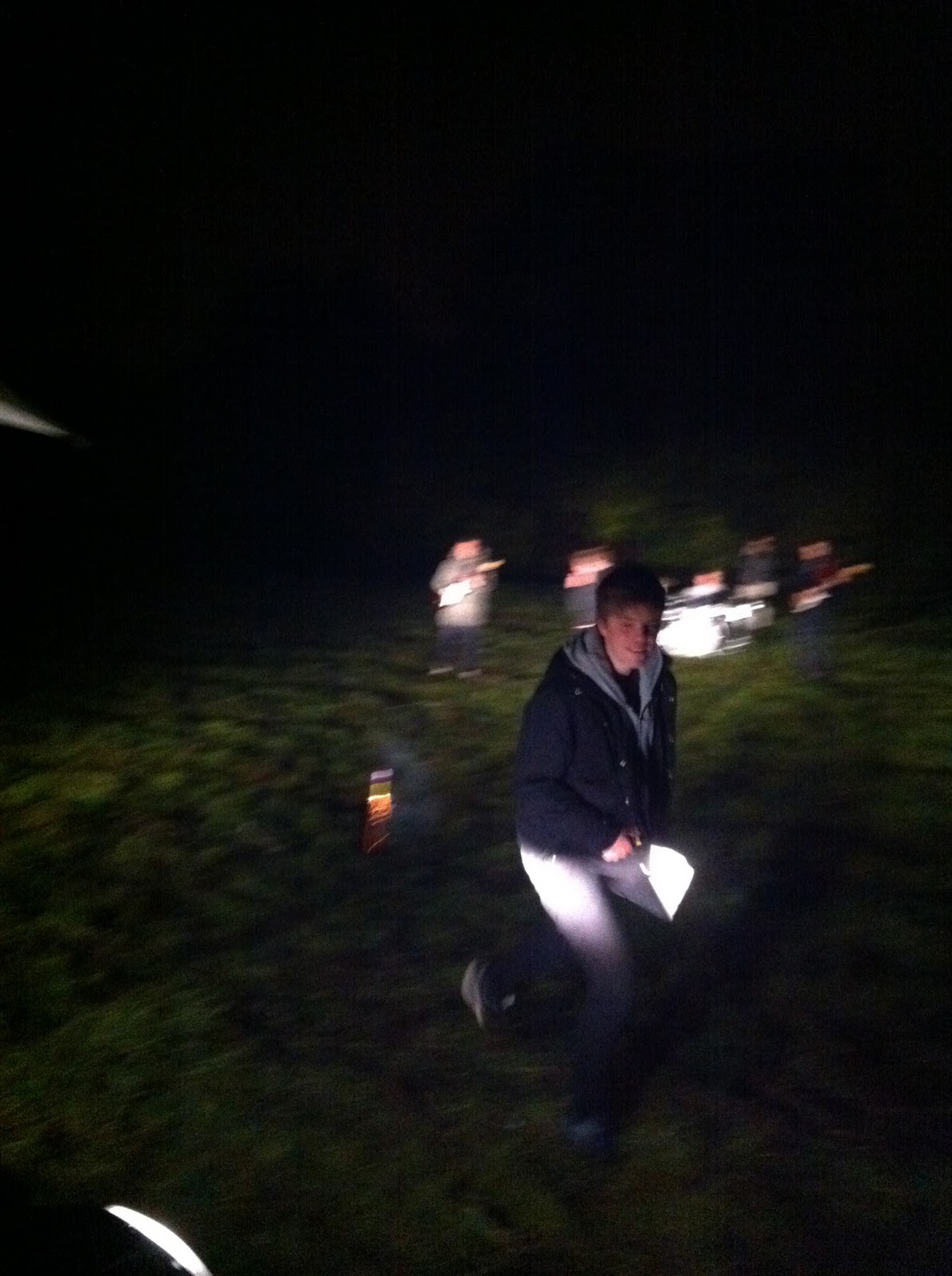
This evening we filmed in the field, for a draft music video. (Yes I am blogging at 02:42). We found that overall filming went well, the weather held out, fortunately and the lighting from cars worked perfectly. If we could pick out one thing that maybe went wrong it was that we maybe missed 2 shots but this is only a very minor issue. Below are a few pictures taken on my iPhone of the shoot.


Thursday 27 October 2011
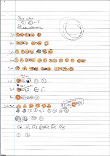
Shot Schedule
As Pat and I have both discovered after discussing with other students who have managed to film their videos, a lot of the time shots can get easily muddled up. Another problem is with continuity, rather than moving the camera back and forth between different shots we want to film all similar shots, with the same band member at the same time. So ideally, we will never move the camera from one angle back to the same angle, thus giving us a good oppurtunity to keep shot similarity and continuity.
A difficulty in our vision for our video also is that we have 2 different types of shots in terms of what they feature. Some shots feature the band performing the song with instruments then the others will feature them dancing. This will be a factor in deciding what order we shoot, so that we are not moving instruments, particularly a drum kit, back and forth from in and out of shot.
For this puropse, I have created a shot schedule. At first glance, this will not make much sense to anyone besides me or pat. Basically, all shots are on this page going in order. The highlighted orange numbers are shots which feature the band playing instruments, the non-highlighted are those with the band dancing.
This will be the sheet in which we will work from when filming.

Note: Shots 30 & 31 feature a band member setting off a firework, this may not feature in our draft so I have not included them fully in the shooting schedule.
Tuesday 25 October 2011
Filming the music video - update
For the draft video, we will be filming using a canon 500d, which was kindly lent to us. One change we have made for the filming is that of the members of the band. As 2 of the band members are busy, we are going to replace them with Ed Price and Sam Burnham or Sam Hallam. For the final media shoot, we may use the original band members, depending on who we think suits the roll best.
Another problem we face ahead of filming is that of the weather. In an ideal world we would have filmed last week, when the weather as a bit brighter but I happened to be on work experience, without anytime in evenings to film. If rain does occur we will have to film at a later date, as everything is planned to be outside.
Another problem we face ahead of filming is that of the weather. In an ideal world we would have filmed last week, when the weather as a bit brighter but I happened to be on work experience, without anytime in evenings to film. If rain does occur we will have to film at a later date, as everything is planned to be outside.
Monday 24 October 2011
Prop List
Props that we will need for shooting our video:
Instruments:
Instruments:
- 2 x guitars
- 1 x bass guitar
- 1 x drum kit
- 2 x mic stand
- 1 x drum sticks
- 1 x maracas
Other:
- 3x fireworks
Sunday 16 October 2011
Album name and tracks - update
For my digipak draft, I have chose to use Little Comets debut album title, "In Search Of Elusive Little Comets. I felt that as it has already being made, the title just works well with my digipak. I also used the same track-listings as on "In Search Of Elusive Comets", as there is a diverse range of track names.
Friday 14 October 2011
Draft magazine advert
Below is the draft magazine advert, I tried to keep it simple taking inspiration from Radiohead's "In Rainbows"...


One thing I am going to take into consideration for the next time I draft is maybe using an image, and changing the font.
Digipak draft
For my draft version of the digipak, I tried to keep things very simple, taking inspiration from artists like Jamie xx and SBTRKT...


Draft Album Magazine Adverts/Posters
I have used the same images, fonts and colour schemes to create these draft posters. I feel as though this would help promote the alum better as the audience could become familiar with these motifs and recognise them as promotion of the album increases.


CD Cover analysis 3
The Chemical Brothers - Surrender

This album cover features a long wide shot with focus of a man throwing his arms up in the sky. The image has been filtered and saturated. It has an effect to make only block colours show up and almost cartoon-like, I feel this works very well and looks good on an album cover. The image is shot at the Olympia arena in London, it features the crowd in the background and a mainly focused person in the foreground, which is the icon of the cover. While the original picture may have been a bit blander, with a basic, darker colour-scheme - the use of filtering and enhancing the photo has made it very bright and colourful. The band name and album title are in the top corners of the cover in contrasting white. The font used for 'The Chemical Brothers' is the signature font for the band, while 'Surrender' is in a basic text, but works well on this cover.

On this inside cover the only thing featured are the credits to the album written in blue text on a plain white background. The font is basic and does not need to be decorative or artistic in anyway as it is not aimed to be eye-catching.

The CD is very basic, again featuring the signature font for the band name and some legal information including the record label etc.

The back cover opposes the bright and colourful front cover with a mainly black back cover. There are close up facial shots of the members of the band, with low lighting to match the colour of the background. The track listing is written very basically in a smart font, which appears very formal. The Chemical Brothers logo is shown at the top of the page and the spine of the album.
Thursday 13 October 2011
Draft CD covers

I used this image I took quickly to create these draft covers, Although I have not chosen one final draft design. I have gone for a black and white filtered image of the models. I like the use of coloured text more than just plain black texts as it gives me a better colour scheme that I could use throughout my digipack.


Subscribe to:
Posts (Atom)